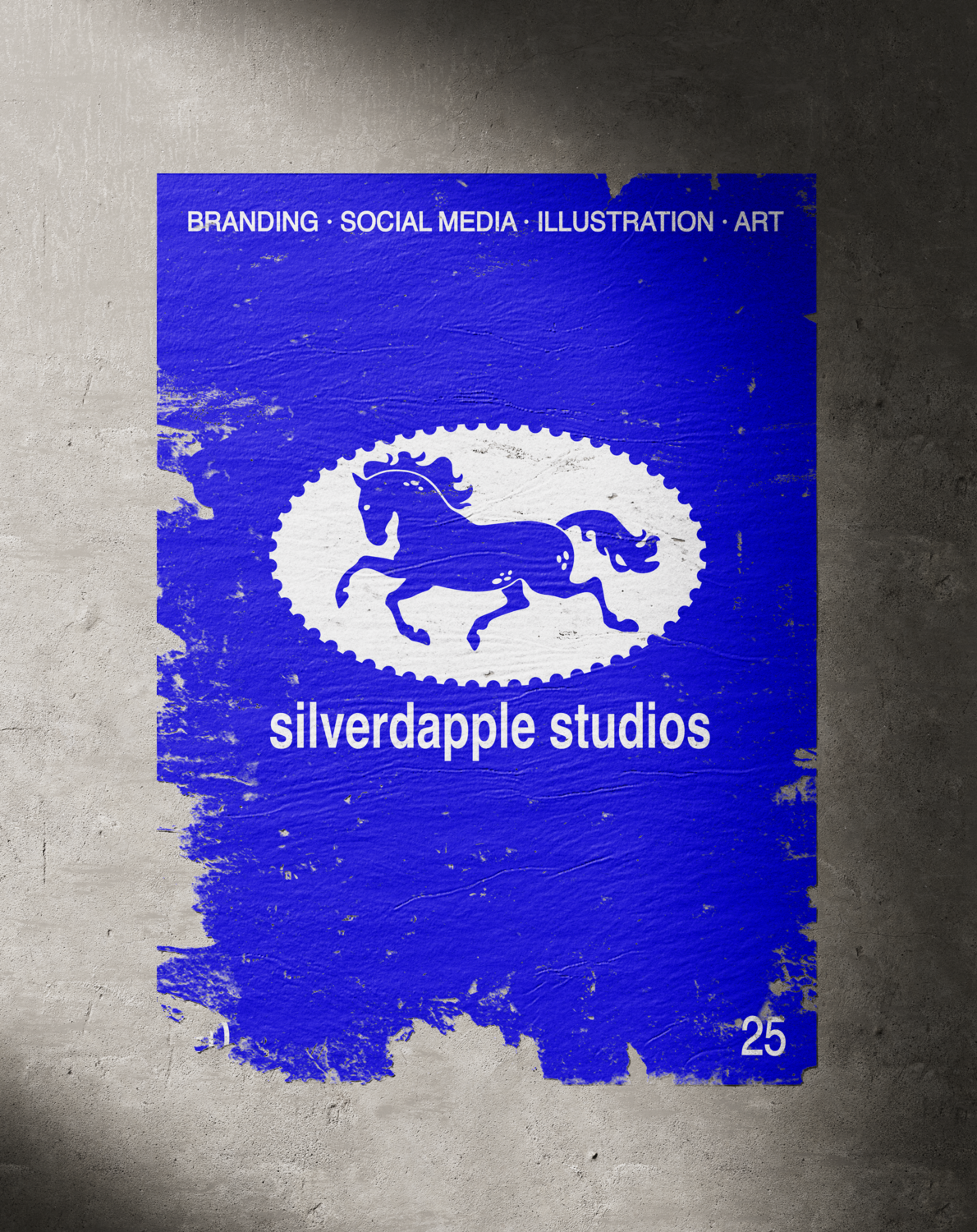
SILVERDAPPLE STUDIOS

PERSONAL BRANDING
THE BRIEFING
Create a personal brand identity that represents my design projects and artworks under one unified name: Silverdapple Studios.
The identity needed to reflect my personality and creative vision while staying professional, versatile, and adaptable to different platforms and audiences.
THE OBJETIVE
To build a cohesive brand with a clear style, one that feels personal, dynamic and reliable. Establish a recognizable visual identity that felt present but doesn’t overshadow the projects showcased, either on the website or social media.
Develop a clean image to communicate reliability and style, with a logo that has character and interest. Form a cohesive system that could adapt easily to digital and print formats, ensuring Silverdapple Studios has a recognizable and versatile visual identity.
THE RESULT
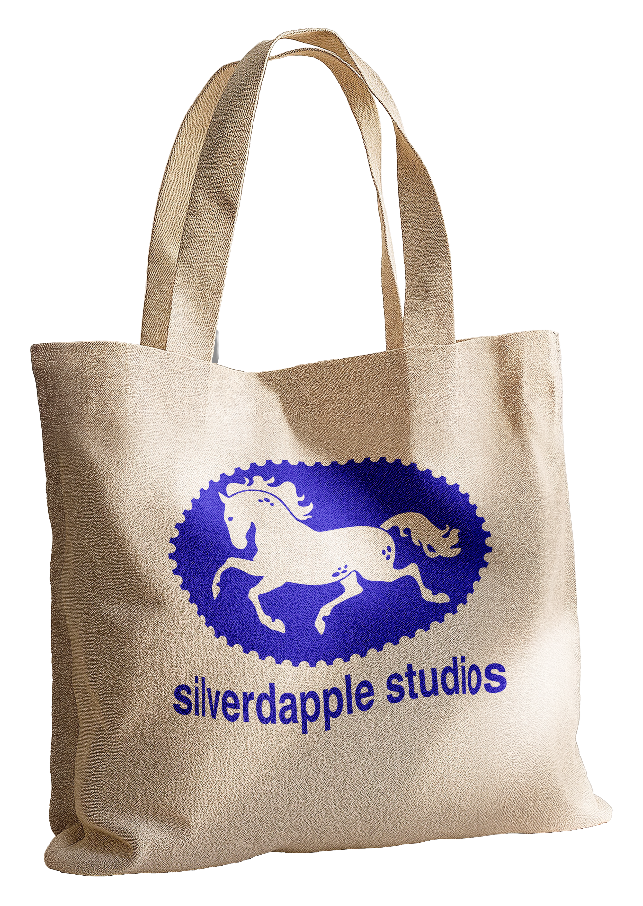
A brand identity with clean and aesthetic color palette, a stamp-inspired logo and the clean, timeless use of Helvetica as the main typeface.
This combination creates a balance between clarity and personality: stylish yet minimal, professional yet approachable.

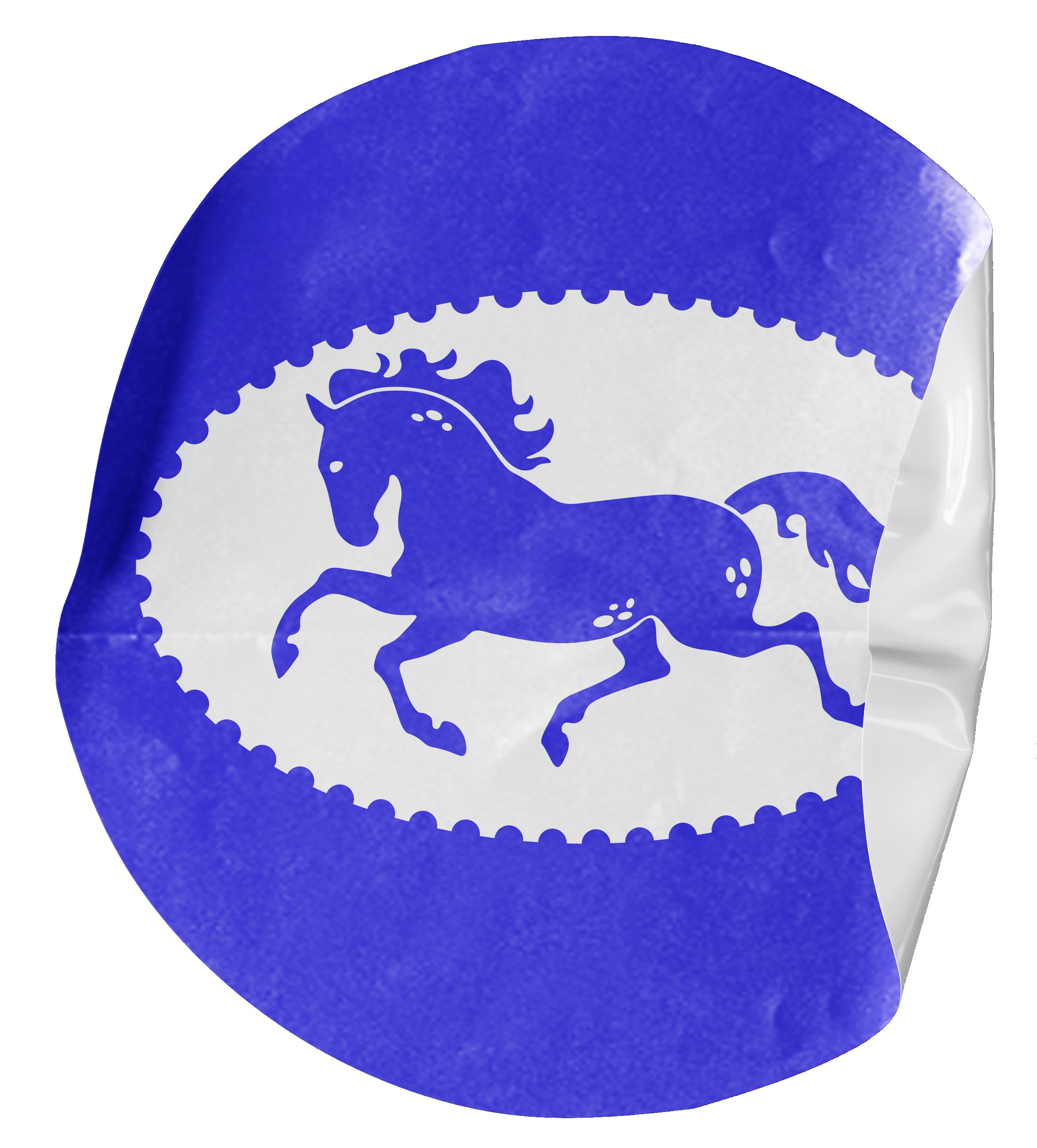
LOGO DESIGN
Personal and dynamic are the two key words that inspired the creation of the logo for this brand. The galloping horse, drawn by me, symbolizes my art journey, which started by drawing horses as a child. Its movement is flowy and gracefull, giving a dynamism I’ve always aimed to achieve with my artworks.
INSPO
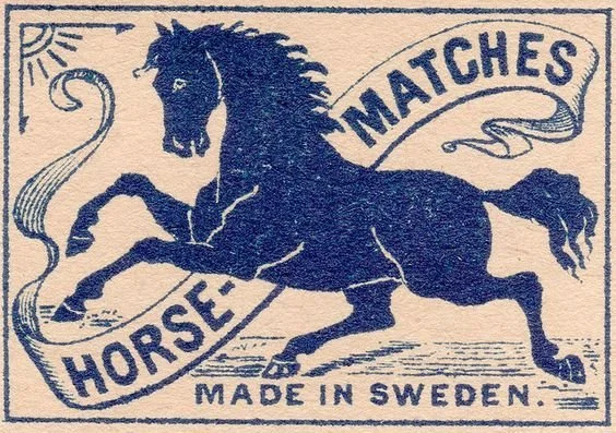
To achieve the look of something a bit more old school, that I knew I wanted to add, I took inspiration from stamps and their borders. The addition of the stamp border to this logo acts not only as a frame but also the idea of stamping my work, either physical or digital, with my own brand.
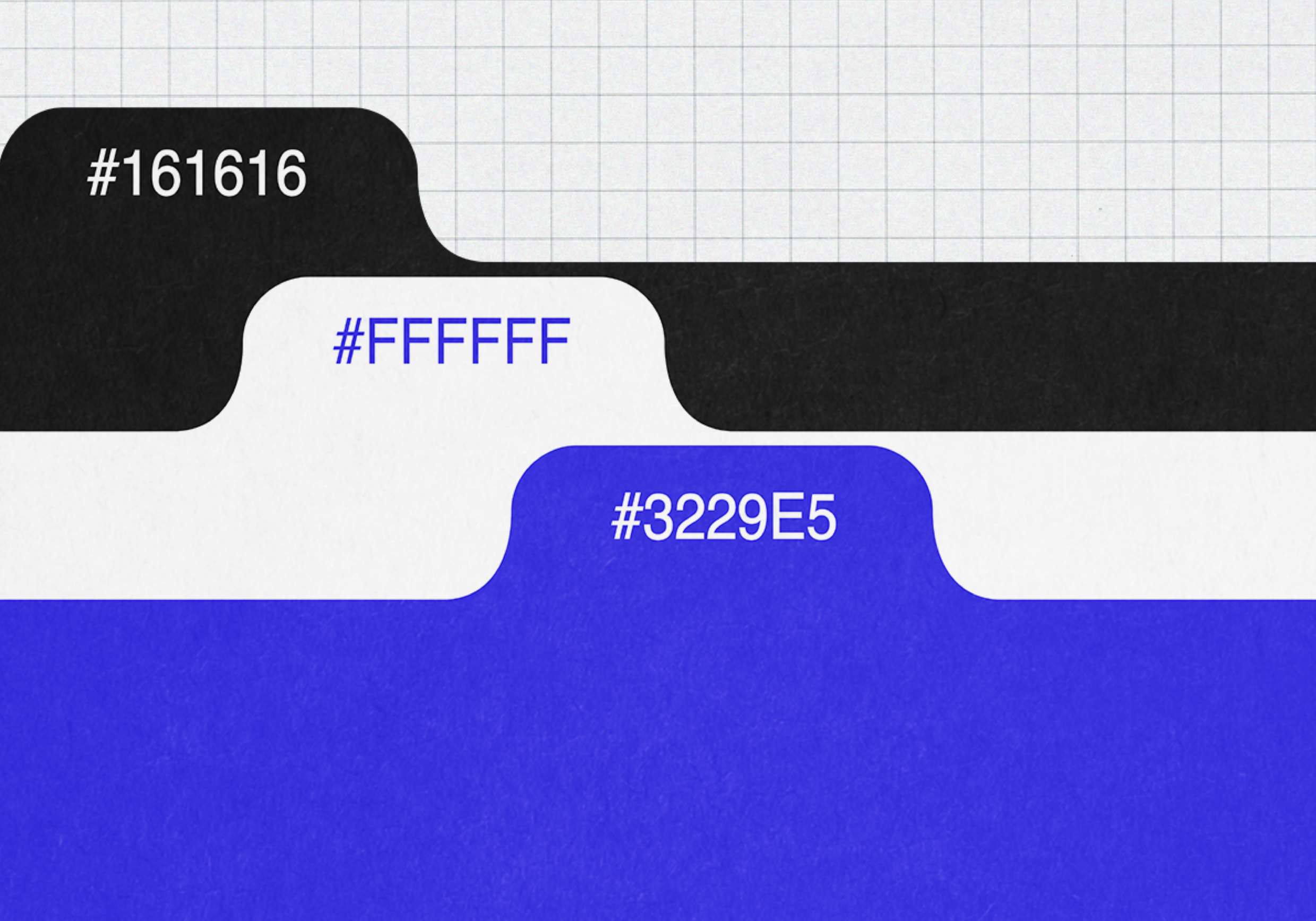
THE COLORS
Choosing a somewhat limited color palette was a deliberate choice. I wanted a clean look, both modern and with a old school style. Blue is the accent color, linked to reliability and stability, which are key feelings I wanted to transmit.
THE ENERGY
Silverdapple Studios carries an energy that is personal and approachable while staying stylish and professional. The color palette gives the brand a clean and reliable presence, while the stamp-like logo adds character and individuality. Paired with the simplicity of the font Helvetica, the brand identity feels dynamic yet grounded, with a personal touch that hopefully makes it distinctive and memorable.
WHY SILVER DAPPLE?
One of my niche interests is horse coats and how their genetics work. One of my favourite coats? Silver dapple! The contrast of a flaxen mane with a dark chocolate coat really pleases my eyes and well… It sounds cool.
WHY horses then?
I can credit my creative journey to horses. They have inspired me to create since I was a little girl, learning to hold a pencil, determined to draw those strong, sleek animals. I don’t only draw or paint horses anymore, I’ve branched out, but they continue to be one of my main inspirations, and I’ll never stop involving them in my creative projects.